Assignment 05
Scales, Axes, Transitions
Due: Feb. 24, 2021 03:29:59 PM
Graded: Mar. 02, 2021
Percentage of Grade: 6%
Assignment Description: Finalized
- Objectives
- Description
- Part 1: Use of d3 Scales
- Part 2: Creating Axes in D3
- Part 3: Animation
- Submission
- Grading
- Extra Credit
In this assignment, you will learn to use additional features in d3 so as to improve the visualizations you built in A04 for the Calvin college dataset.
Please click here to create your repository
Objectives
This assignment is designed to practice mode advanced concepts in d3. Specific objectives include:
- Practicing how to use d3 scales for defining the mapping between data value and visual element
- Learning how to define and use d3 axes, based on scales, so as to use visual elements to give context to your plots
- Exploring the use of d3 transitions for updating the data and presentation in d3. These transitions will be triggered by responding to HTML buttons.
Description
Your task for this assignment is to generate one visualization that allows you to interactively investigate the Calvin college dataset through multiple views. This will combine elements of the last two assignments, but leverage new features in d3 so as to make for more effective visualizations.
Specifically, you should generate a scatterplot visualization of the Calvin college dataset where:
SATVis used to define the \(x\)-coordinateACTis used to define the \(y\)-coordinateSATMis used to define the radiusGPAis used to define the color.
This visualization should be created with an SVG element whose id is scatterplot_1 and this should be append in your index.html within the div tag whose id is vis1. This chart should have width and height of 500 pixels.
Your visualization must be constructed so as to specify the following requirements.
Part 1: Use of d3 Scales
Somewhere in your code for A04, there’s very probably some code that looks like this:
svg.selectAll("circle")
    .attr(/*NAME*/, function(d) { /* SOME CODE HERE */ })
This code should be replaced with:
svg.selectAll("circle")
    .attr(/*NAME*/, function(d) { return attrScale(d.ATTR); })
To do so, you will have to define individual scales to replace attrScale(). Each of these has a different specification as described next. You may also find that d3.min(), d3.max(), and d3.mean() will be useful helper functions in creating your scales.
Circle Positions
Your code for cx and cy should look similar to this:
svg.selectAll("circle")
    .attr("cx", function(d) { return cxScale(d.SATV); })
    .attr("cy", function(d) { return cyScale(d.ACT); });
Specifically, you’ll define two separate scales cxScale() and cyScale() that map from SATV to \(x\)-position and ACT to \(y\)-position. Both of these scales should be instances of d3.scaleLinear(), configured appropriately.
Circle Radii
You will similarly create a function rScale() to control the mapping from SATM to the circle radius. However, rScale() should be created using d3.scaleSqrt(). As we saw in class our visual system will respond more directly to area in terms of mapping. By setting the radius to be relative to the square root, the area of each circle will correspond directly to the value.
The smallest circles should have radius 2, and the largest circles should have a radius of 12.
Circle Colors
You will implement a number of colormaps variations. Buttons will be used to toggle which color map is displayed. In the assignment repo, index.html and buttons.js include a minimal example for how to use d3 to create buttons that react to when you click on them. The three color scales are:
-
Create a continuous color scale that interpolates linearly from the minimum
GPAin the data being given colorblue, to the maximumGPAin the data being given colorred. -
Create a continuous color scale that uses three of the colors in RdYlBu-5 as follows. The minimum
GPAshould be given#2c7bb6(the first color – blue), the averageGPAshould be given#ffffbf(the third color), and the maximumGPAshould be given#d7191c(the fifth color). Hint: read the documentation on d3 scales. -
Create a quantized color scale that uses all five colors in RdYlBu-5 such that the minimum
GPAgets the blue color, the maximumGPAgets the red color, and there are five “bands” ofGPAvalues each mapped to one of the colors. Hint: read the documentation on d3 quantize scales.
Your buttons should have the following ids: colormap-button-1, colormap-button-2, and colormap-button-3. Their behavior should be such that when we click on the button, the points in the visualization switch to the corresponding colormap. Below are examples of what these should look similar to:
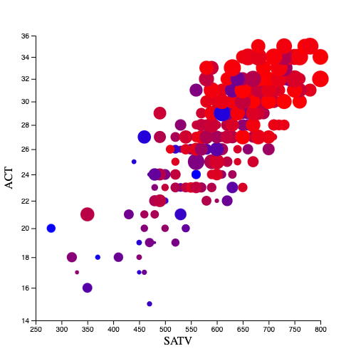 |
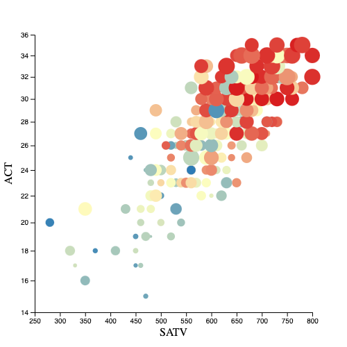 |
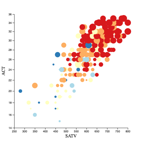 |
| Colormap 1 (continuous RdBu) | Colormap 2 (continuous RdYlBu) | Colormap 3 (quantized RdYlBu-5) |
Part 2: Creating Axes in D3
Next, you will add d3 axis annotations to this same scatterplot, by using the objects d3.axisLeft() and d3.axisBottom(). Follow the example here (search for “axisBottom”). Note that d3 axes use some pre-defined CSS classes by default. The easiest way to make the axes plot the way you want is to add CSS declarations to your HTML. Again, follow the example above.
You will also find that Murray, Chapter 8 (available electronically through the UA Library for those on campus) gives a good coverage of creating axes and linking them with your scales.
Be sure to label your axes as well. You are welcome to pad your scatterplot as you wish to make room for the axes and labels.
Part 3: Animation
When changing the circle colors, make the change an animated transition of duration 1.5 seconds, using d3 transitions in response to your button presses.
Submission
You should use git to submit all source code files. The expectation is that your code will be graded by cloning your repo and then executing it within a modern browser (Chrome, Firefox, etc.)
Please provide a README.md file that provides a text description of how to run your program and any parameters that you used. Also document any idiosyncrasies, behaviors, or bugs of note that you want us to be aware of.
To summarize, my expectation is that your repo will contain:
- A
README.mdfile - A
index.htmlfile - An
a05.jsfile - All other Javascript files necessary to run the code (including
calvinScores.js,button.jsandd3.jsplus any others you require) - Any
.cssfiles containing style information
Grading
Deductions
| Reason | Value |
| Bugs or syntax errors | -10 each bug at grader's discretion to fix |
Point Breakdown of Features
| Requirement | Value | ||||||||||||
| Consistent modular coding style | 5 | ||||||||||||
| External documentation (README.md) following the template provided in the base repository | 5 | ||||||||||||
| Header documentation, Internal documentation (Block for functions and Inline descriptive comments). Wherever applicable / for all files | 10 | ||||||||||||
Expected output / behavior for your chart based on the assignment specification, including
| 80 | ||||||||||||
| Total | 100 | ||||||||||||
Cumulative Relationship to Final Grade
Worth 6% of your final grade
Extra Credit
Implementing features above and beyond the specification may result in extra credit, please document these in your README.md. In addition, here is a concrete suggestion to try consider:
Position Transitions (worth up to 10% extra credit)
Add two buttons to your webpage that will toggle the \(x\)-coordinate of your circles, alternating between SATV (the value you started with above) and the cumulative score, SATM + SATV. The button to choose SATV values should have id SATV, and the button for the cumulative score should have id SAT-cumulative. Note that these two data attributes have significant different ranges, and you should make the position scale of both cases “nice”
For full credit, this transition should be animated. In addition, the axes and tickmarks will need to be animated as well! Hint: this is way, way, easier than it seems; d3 does what you would hope for here.