Assignment 03
Javascript
Due: Feb. 08, 2021 03:29:59 PM
Graded: Feb. 14, 2021
Percentage of Grade: 5%
Assignment Description: Finalized
In this assignment, you will use the SVG creation functions we developed in L04 to design simple visualizations for a dataset.
Please click here to create your repository
Objectives
This assignment is designed to teach using Javascript to manipulate SVG objects so as to create a simple visualization. Specific objectives include:
- Practicing and reviewing Javascript syntax for specifying SVG elements and their attributes
- Experimenting with the basics of enumerable types and higher order functions in Javascript
- Using these tools to generate simple visualizations of a dataset
- Developing these visualizations through the paradigm of mapping data elements to visual elements by implicitly looping over the dataset with the specified attribute getters (a key concept we’ll see in d3).
Part 1: Basics
You will submit an HTML file named index.html, together with any other files you choose to create and reference. This file will include all visualizations you are tasked with (described below). Each visualization should be an SVG element of 500 pixels in both width and height. The id of the element containing the first visualization should be scatterplot_1, the id of the element containing the second visualizations should be scatterplot_2, and so on. I found it easiest to append these svg elements to div elements that I created with the ids chart_1, chart_2, and so on, but you are welcome to deviate from this and arrange the charts in the HTML file as you see fit.
Source Files
For this assignment, you are NOT allowed to use any source code other than the files we provide in links from this document. Do not use d3 or other helper libraries. I suggest that you create a file a03.js that is loaded by index.html and use this as your main development file.
You should, however, use the Javascript functions in the svg.js source file included in the starter repo. These are the functions we developed in class to create SVG elements, together with a helper function for you to create RGB triplets (in order to give your visualization data-driven colors)
Dataset
This dataset ref contains standardized scores for all Calvin College 2004 seniors that have taken both the ACT and the SAT, together with their GPAs. There are 271 data points and 4 dimensions.
For your convenience, I have processed the original csv file into a Javascript source file included in the starter repo named scores.js. The dataset looks like this:
var scores = [
 { SATM:430, SATV:470, ACT:15, GPA: 2.239 },
 { SATM:560, SATV:350, ACT:16, GPA: 2.488 },
 { SATM:400, SATV:330, ACT:17, GPA: 2.982 },
 { SATM:410, SATV:450, ACT:17, GPA: 2.155 },
// 263 more rows
 { SATM:700, SATV:680, ACT:35, GPA: 3.911 },
 { SATM:720, SATV:770, ACT:35, GPA: 3.981 },
 { SATM:750, SATV:730, ACT:35, GPA: 3.882 },
 { SATM:790, SATV:780, ACT:35, GPA: 3.887 }
];
Part 2: Visualizations
You will create three different visualizations of this dataset:
Visualization 1
Create a scatterplot of circles, showing SAT’s verbal scores (SATV column) versus SAT’s mathematics scores (SATM column). In other words, the \(x\)-coordinate of the plot should encode the SATV variable, and the \(y\)-coordinate should encode SATM. All circles should have a fixed radius and color (please customize these as you see fit).
Visualization 2
Next, create a different scatterplot, now showing the relationship between:
- GPA scores (
GPAcolumn) on the \(x\)-axis, - ACT scores (
ACTcolumn) on the \(y\)-axis, - the radius of the circles to represent
SATVscores, and - color to represent
SATM. When selecting colors, you will have to map the range ofSATMvalues to possible shades of colors. Note that the functionrgb()insvg.jsexpects values forr,g, andbin the range \([0,1]\). See iteration_8.js for an example of how one might do this mapping, but you are encouraged to experiment.
Visualization 3
Finally, create a third scatterplot where:
- the sum of the SAT scores specifies the \(x\)-coordinate,
- GPA scores are on the \(y\)-axis,
- radius is fixed
- color represents ACT.
Submission
You should use git to submit all source code files. The expectation is that your code will be graded by cloning your repo and then executing it within a modern browser (Chrome, Firefox, etc.)
Please provide a README.md file that provides a text description of how to run your program and any parameters that you used. Also document any idiosyncrasies, behaviors, or bugs of note that you want us to be aware of.
To summarize, my expectation is that your repo will contain:
- A
README.mdfile - A
index.htmlfile - An
a03.jsfile - All other Javascript files necessary to run the code (
svg.js,scores.js) - (Optionally) any
.cssfiles containing style information
Grading
Deductions
| Reason | Value |
| Bugs or syntax errors | -10 each bug at grader's discretion to fix |
Point Breakdown of Features
| Requirement | Value | ||||||
| Consistent modular coding style | 5 | ||||||
| External documentation (README.md) following the template provided in the base repository | 5 | ||||||
| Header documentation, Internal documentation (Block for functions and Inline descriptive comments). Wherever applicable / for all files | 10 | ||||||
Visualization 1
| 20 | ||||||
Visualization 2
| 35 | ||||||
Visualization 3
| 25 | ||||||
| Total | 100 | ||||||
Cumulative Relationship to Final Grade
Worth 5% of your final grade
Extra Credit
Implementing features above and beyond the specification may result in extra credit, please document these in your README.md. In addition, here are some concrete suggestions to consider:
Improve and Justify Visualization 2 (worth up to 10% extra credit)
Think about the above specifications for the visualizations: is it the best way to portray the interesting features of the data? (Answer: It’s fine, but not ideal.)
Your goal for the final visualization is to improve upon Visualization 2. Since we have we have not discussed perceptual principles in class yet, you do not need to give serious justifications for your choices. This option is mostly a chance for you to explore different variants: try your best to justify your decisions.
Together with the improved visualization, submit no more than two paragraphs of text describing your changes and reasoning. This text should be embedded in the submitted HTML. For this improved visualization, you should use an element with id attribute equal to scatterplot_2b. Improved visualizations without reasoning and justification will not receive any extra credit.
Hints:
-
How helpful is the combination of the circle radius with circle color? It might help to look ahead a bit to L08’s reference on preattentive processing.
-
Visualizations 2 and 3 suffer from some amount of overplotting. How would you solve it? (Overplotting is what happens when the second shape your draw goes entirely over the first shape. As a result, you cannot tell if the first point was there to begin with, or, more generally, how many points are “hiding”) It might help to consider ways in which more than one shape can contribute to the final color of each pixel.
Axis Annotations (worth up to 40% extra credit)
Add axis lines, labels and tick marks to the \(x\) and \(y\) axes of your visualizations. In other words, to get this extra credit, instead of looking like this:
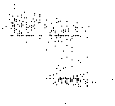
your plots should look like this:
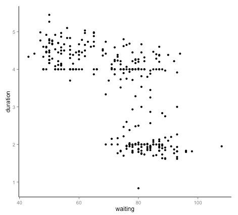
(Of course, the dataset I just used in the example above is not the same as the one you have, so the values for the tick marks, labels, etc. will all be different).
Some things you will need to consider:
- margins for your axes, tick marks, and axis labels
- try to pick good values for the tick marks, and a good number of them: not too many, and not too few.
Just like with the other portions of this assignment, you are not allowed to use or consult other Javascript libraries. Your axes should be made purely in SVG elements generated with Javascript calls.